After consulting with the product manager, I gained a clear understanding of the system's operation.
I defined a KPI:
Reduce the number of daily agent calls to the system
administrator caused by malfunctions or misunderstandings
from 40 to 10 (a 75% reduction) within six months.
Where would you like to travel?
next
Bike tracks
archaeological
sites
Forests and
parks
Excursions
are available
Tracks
Guided
tours
Parking lots
Sailing and
surfing
picnic
9:41
UI UX researcher & designer
A system for mobile line agents and mobile devices:
Reducing Daily Support Calls by 75% in 6 Months.
Figma & Framer | Oct. 2024 – Mar. 2025
KPI
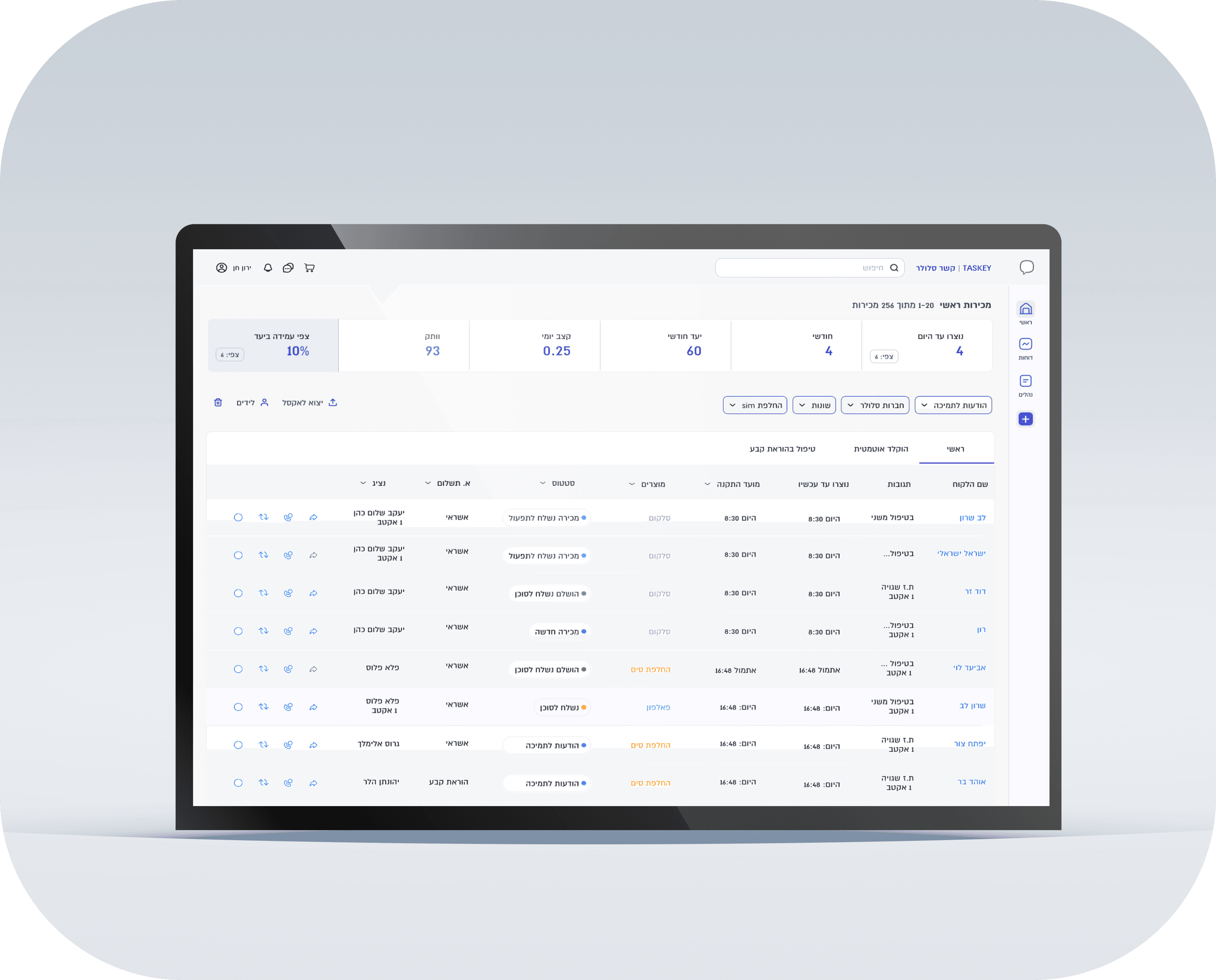
B2B Interface for Cellular Line and Mobile Device Agents.
This CRM system is designed to streamline essential operations, including:
Line connections with mobile carriers and number portability between different providers.
New Product Ordering - Providing a central platform for agents to order SIM cards, devices and accessories, ensuring smooth inventory management and customer fulfillment.
background
After consulting with the product manager, I gained a clear understanding of the system's operation.
I defined a KPI:
Reduce the number of daily agent calls to the system administrator caused by malfunctions or misunderstandings from 40 to 10 (a 75% reduction) within six months.
Market analysis
Research
I conducted market research on various systems, including:
CRM systems, Product ordering systems, Cellular company websites

I have noticed that in systems, it is common to use colored highlights to improve user scanning, such as for status indicators.

I noticed that the systems offer comprehensive filtering options and also incorporate a chatbox where necessary,
User research
I conducted a user survey among agents to gather insights on their experience with the system.
22 users responded to my survey.
Survey

I interviewed users with different usage patterns of the system to understand their main uses, difficulties and essential activities. I measured these activities by need, frequency and difficulty.
Interview
Job Leval
System Administrator
Update the system on the progress and status of the process.
Provide real-time status updates to agents waiting for line connection.
Ensure successful line connections with cellular companies.
Troubleshoot line transfers.
Monitor and ensure successful connection of all lines, including problematic lines.
System Administrator
Complete control of the system with in-depth knowledge of its functionality.
System Capability:
Required Skills and Knowledge:
Technical-- Knowledge:
Telecom and Networks – SIM m
System Administration – CRM, ERP and Telecom platform management.
Database Management – Retrieve and analyze customer/order data.
Operational and Soft Skills:
Workflow Optimization – Streamline and improve the line transfer process.
Troubleshooting – Identify and resolve transfer and system issues.
Communication and Coordination - Liaison with agents and technical teams.
Time Management - Handling high call volumes efficiently.
Tools used:
Google Sheets, Excel - Data analysis and tracking.
Gmail - Communication with teams and customers.
Cellular company websites - for connecting lines, etc.
Task analysis:
Task Description
Connects lines in the system for
agents with cellular companies
Relocation operation
Checks the porting status in 'Status'
Updates the migration status in the system
Addresses problems created by line connections
Checks responses from agents in the system
Importance
5
5
4
5
5
5
Frequency
5
5
5
5
3
5
Difficulty
1
4
4
0
4
0
Priority Score
11
14
14
14
10
12
10
14

Job Leval
Product Agent
Orders products for their store through the system.
The supply team delivers the order.
Occasionally connects mobile lines through the system (in most cases, connections are made directly with the company).
Reports to the system manager on the status of mobile lines they have connected.
Task analysis:
Task Description
Ordering products for the store
Checks past orders
Checks the porting status in 'Status'
Connects lines in the system
Pays by credit card for products sold in the store
Importance
5
4
5
5
5
Frequency
5
5
5
5
5
Difficulty
1
5
0
0
3
Priority Score
11
14
10
10
13
Job Leval
Connecting Cellular Lines:
Connects cellular lines within the system. The system administrator carries out the necessary operations with cellular companies and updates the system accordingly.
Mobile Device Ordering: Places orders for mobile devices through the system. The delivery team processes and fulfills the orders.
Task analysis:
Task Description
Connects lines in the system
Checks the porting status in 'Status'
Ordering products
Mobile Device Ordering
14
Job Leval
Company secretary
Responding to all agents regarding SIMs, deliveries, connections, and other related issues.
Liaising with cellular service providers.
Responsible for issuing invoices.
Overseeing various aspects of business management across multiple issues.
12
Task analysis:
Task Description
SIM inventory update
Updating line connections
Checking reports in the system


feature list
Must have
I compiled a list of features, derived from all research stages,
that need optimization in the system.
Should have
Leave a voicemail
Sales graph by company
Price comparison between companies
When entering the data, the company's benefits will be displayed.
SIM Porting History
Line Connection
Clear and accessible menu
Action button for sending a chat message
Activate button 'New Transfer'
Porting Status Check
System updates received via email will also be available in the system with filtering options, as well as WhatsApp notifications.
Product order
Accessible button for ordering a new product
Enhanced product cart
Extensive order history (going back years)
Accessible credit card payment
Order check by the last 4 digits of the credit card.


After mapping the problem, I identified and defined the key challenges.
The main action button opens a long product selection menu, which should be strategically placed so that agents can easily view and filter products
01
Visibility of the Main Action Button
01
הוספת מכירות ומידע
Clicking opens a long product selection menu, but since this button triggers an action, it shouldn’t be placed in the menu.
Since this button performs the system’s core function, it must be consistently visible across all screens.
Adding a product requires repeated logins,
The menu hides the desktop view,
No filtering option.
02
Optimizing the Product Selection Menu
01
הוספת מכירות ומידע
Clicking opens a long product selection menu, but since this button triggers an action, it shouldn’t be placed in the menu.
Adding a product requires repeated logins,
The menu hides the desktop view,
No filtering option.
Challenge
The cart should be in a fixed, easily accessible location, visible from every screen in the system.
03
Cart Placement
01
הוספת מכירות ומידע
Clicking opens a long product selection menu, but since this button triggers an action, it shouldn’t be placed in the menu.
Adding a product requires repeated logins,
The menu hides the desktop view,
No filtering option.
In the first stage, I carefully analyzed the information and identified patterns within the data.
This allowed me to logically categorize the information into three distinct groups,
Information architecture:
01
הוספת מכירות ומידע
Clicking opens a long product selection menu, but since this button triggers an action, it shouldn’t be placed in the menu.
Adding a product requires repeated logins,
The menu hides the desktop view,
No filtering option.
01
הוספת מכירות ומידע
Clicking opens a long product selection menu, but since this button triggers an action, it shouldn’t be placed in the menu.
Adding a product requires repeated logins,
The menu hides the desktop view,
No filtering option.
Home
page
Home
page
Reports
Benefits
Orders
Performance
Connections
Token
SIM inventory
Hysterical
report
Forms and procedures
Contact us
Procedures
Add a sale
Wagon
This led me to realize that a concise menu that expanded into a more detailed menu would provide me with an answer, I researched similar menus to gain insights into their structure and user experience.
01
הוספת מכירות ומידע
Clicking opens a long product selection menu, but since this button triggers an action, it shouldn’t be placed in the menu.
Adding a product requires repeated logins,
The menu hides the desktop view,
No filtering option.
01
הוספת מכירות ומידע
Clicking opens a long product selection menu, but since this button triggers an action, it shouldn’t be placed in the menu.
Adding a product requires repeated logins,
The menu hides the desktop view,
No filtering option.


Solution
01
הוספת מכירות ומידע
Clicking opens a long product selection menu, but since this button triggers an action, it shouldn’t be placed in the menu.
Adding a product requires repeated logins,
The menu hides the desktop view,
No filtering option.
I designed a wireframe of
a collapsible side menu that expands into a wider menu:
The Add Product button remains visible at all times, ensuring easy access to the drop-down menu and an optimal user experience.
Transitions between the main system actions are smooth, requiring minimal mouse movement.
Users can minimize the menu to expand their workspace, creating a more comfortable and efficient workspace.
I ensured that the learning curve for the new menu would be smooth and intuitive by using a logical structure with familiar and clear icons.
+
+
דוחות
נהלים
+
טפסים ונהלים
יצירת קשר
חיבורים
ביצועים
דוחות
מלאי סימים
טוקמן
הזמנות
הטבות
סלולר
הזמנת מוצרים
הודעות לתמיכה
נייחים תשתיות
החלפת SIM
שונות
דיווח סלולר
ראשי
דוחות
נהלים
+
01
הוספת מכירות ומידע
Clicking opens a long product selection menu, but since this button triggers an action, it shouldn’t be placed in the menu.
Adding a product requires repeated logins,
The menu hides the desktop view,
No filtering option.
01
הוספת מכירות ומידע
Clicking opens a long product selection menu, but since this button triggers an action, it shouldn’t be placed in the menu.
Adding a product requires repeated logins,
The menu hides the desktop view,
No filtering option.
After selecting the 'Add product' button.
A navigation menu opens where each section requires additional filtering between products or companies.
In the original system, filtering was inside the menu. Since the button moved to the main menu, I had to relocate the filter. Now, it's placed at the top of the page itself and the user can select the desired product by scanning.
To maintain consistency, I applied the same filtering layout across all relevant pages.
I created a prototype and confirmed that navigating from the main page to the add product menu is seamless—an important factor since these are the system's most dominant actions.

Cart menu
01
הוספת מכירות ומידע
Clicking opens a long product selection menu, but since this button triggers an action, it shouldn’t be placed in the menu.
Adding a product requires repeated logins,
The menu hides the desktop view,
No filtering option.
01
הוספת מכירות ומידע
Clicking opens a long product selection menu, but since this button triggers an action, it shouldn’t be placed in the menu.
Adding a product requires repeated logins,
The menu hides the desktop view,
No filtering option.
I researched the cart placement on major sales sites like Amazon and Walmart and found that the standard convention is in the top menu on the left (in Hebrew).
The shopping cart appears on all pages, allowing the user to access it from anywhere in the system.
When I showed the manager the menu, he was amused and started apologizing about why their system was not user friendly until now.


I chose to focus on this feature because it will significantly shorten the process for three users.
02
Delay in executing SIM portability from the system.
Situations arise where the system does not automatically perform SIM portability when the customer connects, such as: during night hours when the system is inactive or when certain lines are blocked for portability.
The agent is delayed while the system processes the move, which prevents him from completing the operation, responding to the customer
Causes additional work for the system administrator.
I researched the process of transferring a customer's SIM from their current company to a new one.
01
Customer approval for SIM portability.
To complete the line connection process, the customer's approval for SIM mobility from his current cellular company is required. Since the customer must call the company to confirm, the process continues and causes a delay.
As a result, the agent is delayed even when completing the task,
The operation is still not completed in the system.
SIM portability- problem
To find the right solution, I created a flowchart detailing the process of an agent for SIM portability.
Flow
01
הוספת מכירות ומידע
Clicking opens a long product selection menu, but since this button triggers an action, it shouldn’t be placed in the menu.
Adding a product requires repeated logins,
The menu hides the desktop view,
No filtering option.
Main Sales
"Add Sale"
Button
Select Company
from the
dropdown menu
Fill in details to
connect the
customer
The system
establishes
a connection
Check Status
When activation is
complete, send
a chat message
If the transfer is not
completed at the
time of data entry
Select the
'New Transfer' icon
Waiting for
SIM transfer
Check 'Transfer Status'
to see which company
is currently operating
the SIM
The customer
confirms
Chat sending
option is disabled
The status shows
'Connection
completed'
Solution
01
הוספת מכירות ומידע
Clicking opens a long product selection menu, but since this button triggers an action, it shouldn’t be placed in the menu.
Adding a product requires repeated logins,
The menu hides the desktop view,
No filtering option.
01
הוספת מכירות ומידע
Clicking opens a long product selection menu, but since this button triggers an action, it shouldn’t be placed in the menu.
Adding a product requires repeated logins,
The menu hides the desktop view,
No filtering option.
Send Chat Conversation
Initiate SIM Portability
Check Portability Status
I researched with the system manager how the SIM connection and porting process is carried out.
I implemented automation that allows the agent to perform tasks independently, eliminating the need to wait for the system administrator. This significantly reduces the administrator's workload while enabling the agent to complete tasks and respond to customers more quickly.
Next to each customer in the system,
there will be three buttons:


Orders - problem
01
הוספת מכירות ומידע
Clicking opens a long product selection menu, but since this button triggers an action, it shouldn’t be placed in the menu.
Adding a product requires repeated logins,
The menu hides the desktop view,
No filtering option.
01
הוספת מכירות ומידע
Clicking opens a long product selection menu, but since this button triggers an action, it shouldn’t be placed in the menu.
Adding a product requires repeated logins,
The menu hides the desktop view,
No filtering option.
I researched the existing 'Orders' section, analyzed user pain points.
01
It is not possible to filter orders or view a specific order, even though the user needs to see their past orders.
02
Export to Excel without long and tedious syntax in the Excel lists.
03
One of the most common reasons users enter the system is to check what needs to be ordered.
Currently, to reorder an item, the user must go to the product order menu, search for the desired item, and add it to the cart.
After mapping the problem, I identified and defined the key challenges.
Challenge
01
A detailed, extended filter to enhance user experience and provide a more convenient and efficient search.
01
הוספת מכירות ומידע
Clicking opens a long product selection menu, but since this button triggers an action, it shouldn’t be placed in the menu.
Adding a product requires repeated logins,
The menu hides the desktop view,
No filtering option.
02
Provide a selection option for a specific order with the ability to export it to Excel.
01
הוספת מכירות ומידע
Clicking opens a long product selection menu, but since this button triggers an action, it shouldn’t be placed in the menu.
Adding a product requires repeated logins,
The menu hides the desktop view,
No filtering option.
03
Provide the option to order items directly from the order menu.
01
הוספת מכירות ומידע
Clicking opens a long product selection menu, but since this button triggers an action, it shouldn’t be placed in the menu.
Adding a product requires repeated logins,
The menu hides the desktop view,
No filtering option.
Research
01
הוספת מכירות ומידע
Clicking opens a long product selection menu, but since this button triggers an action, it shouldn’t be placed in the menu.
Adding a product requires repeated logins,
The menu hides the desktop view,
No filtering option.


I conducted market research on product ordering systems, focusing on sales agent systems, which align with my users' work environment.
01
הוספת מכירות ומידע
Clicking opens a long product selection menu, but since this button triggers an action, it shouldn’t be placed in the menu.
Adding a product requires repeated logins,
The menu hides the desktop view,
No filtering option.

I analyzed the current system's user experience and identified areas for optimization.
It can be canceled.
It is essential to enhance the available search options.
It would be better to position it in a more accessible location.
It would be better to position it in a more accessible location.
01
הוספת מכירות ומידע
Clicking opens a long product selection menu, but since this button triggers an action, it shouldn’t be placed in the menu.
Adding a product requires repeated logins,
The menu hides the desktop view,
No filtering option.

Solution
Extended filtering
I added extended filtering for user convenience, along with additional options to make things easier for the product manager.
01
הוספת מכירות ומידע
Clicking opens a long product selection menu, but since this button triggers an action, it shouldn’t be placed in the menu.
Adding a product requires repeated logins,
The menu hides the desktop view,
No filtering option.
"Buy Again"
I added a "Buy Again" option, allowing users to reorder items directly from the 'Orders' section.
This ensures a seamless ordering experience, consistent with the familiar 'Add Product' menu, while also reducing development costs.

01
הוספת מכירות ומידע
Clicking opens a long product selection menu, but since this button triggers an action, it shouldn’t be placed in the menu.
Adding a product requires repeated logins,
The menu hides the desktop view,
No filtering option.
Chatbox
By clicking on the chatbox, the user can export, print, or reorder
a specific order. When selecting the cart, the selected order will be added directly to the cart.

01
הוספת מכירות ומידע
Clicking opens a long product selection menu, but since this button triggers an action, it shouldn’t be placed in the menu.
Adding a product requires repeated logins,
The menu hides the desktop view,
No filtering option.
Easily present order details to the user with a quick scan.
I rearranged the columns in the table so that the most important items appear first. By dragging the cursor, all items in the order will be visible. This allows users to quickly scan the order along with necessary details like date and price.

Business goals
01
הוספת מכירות ומידע
Clicking opens a long product selection menu, but since this button triggers an action, it shouldn’t be placed in the menu.
Adding a product requires repeated logins,
The menu hides the desktop view,
No filtering option.
The system administrator currently handles approximately 100 calls per day, with around 40 of these related to re-transfers or transfer approvals.
By enabling agents to independently perform re-transfers or submit chat-based approval requests, these calls can be reduced to approximately 10 per day, resulting in:
This improvement will improve efficiency and free up time for more critical tasks.
A.
75%
reduction in total calls
B.
The "Buy Again" feature in the Orders menu allows users to quickly reorder previously purchased items in two options. By simplifying the reordering process and encouraging immediate purchases,
This feature aims to increase order frequency and boost overall sales.
Before
200
calls/week
After
50
calls/week
Before
880
calls/month
After
220
calls/month
01
הוספת מכירות ומידע
Clicking opens a long product selection menu, but since this button triggers an action, it shouldn’t be placed in the menu.
Adding a product requires repeated logins,
The menu hides the desktop view,
No filtering option.
I have noticed that some products offer significant discounts when purchased in bulk. However, agents often fail to take advantage of these deals due to limitations such as lack of storage space. To address this, Feature allows agents to buy in bulk, enjoy the discount, and receive the goods in multiple, customized, scheduled deliveries.
The business purpose of this feature is to drive higher sales volume by removing storage constraints as a purchasing barrier. By facilitating bulk orders with scheduled deliveries, feature helps suppliers move more inventory while allowing agents to maximize cost savings.
During the product ordering process, a small icon will appear next to the benefit line, indicating the option for scheduled delivery. When accessing the cart menu to complete the order, the customer will have the ability to schedule the delivery. Clicking on the icon will open a window for selecting a delivery schedule.
C.

Usability testing
01
הוספת מכירות ומידע
Clicking opens a long product selection menu, but since this button triggers an action, it shouldn’t be placed in the menu.
Adding a product requires repeated logins,
The menu hides the desktop view,
No filtering option.
I conducted usability tests on the following topics:
We found it convenient and effective, especially the Add Product menu and with filtering directly on the page. However, we considered moving the 'Tokenman' from the reports menu to the 'Add Product' menu because it makes more sense.
The agent was enthusiastic: "Oh, this is really necessary!"
The system administrator added: "I have been asking for a long time to improve efficiency and make my work easier, however, implementing this feature requires complex development."
Users appreciated the filter box, and also asked to add the chatbox option (to select a specific row in the scan) to the main page. The system administrator asked to give the chatbox a 'Change Status' option.
Menu
SIM portability
Orders
01
הוספת מכירות ומידע
Clicking opens a long product selection menu, but since this button triggers an action, it shouldn’t be placed in the menu.
Adding a product requires repeated logins,
The menu hides the desktop view,
No filtering option.
I appreciate the company for trusting me and giving me the opportunity to contribute to their system.
I would also like to thank the users for their kindness and cooperation, and the product manager for their close collaboration throughout the project.
Although I worked on a few small features within a large system, they required extensive research, troubleshooting, and implementation - teaching me a great deal. I faced challenges in designing for a system with diverse users, varying needs, and even different screen appearances depending on the user’s workflow.
Take aways
next project
Try it yourself
Let's Talk 054.8450521
03
Checking SIM portability status in the system.
There is a situation where it is not clear whether the line has been ported or not, the agent wants to know whether the porting has taken place.
(because there is an exchange line for the customer in any case).
The system can check this, but it requires effort from the system administrator
Delays the agent in providing service and completing the line connection process